Wednesday, December 7, 2011

Done :D

Here is the finished mock-ups for Warehouse Confectionery


Posters

Here are a few posters that helped  me to come up with the idea for this website.

Monday, November 28, 2011

Take two

Just some sketches to show the new ideas for this website will still be following  the layouts posted earlier.


Sunday, November 27, 2011

new ideas.

I was having a hard time with this project. I had to many ideas in my head that kept clashing with each other but after a nice chat with my teacher I am taking his advice and going with a Art Nouveau style for this web site design.  If you wish to learn a bit about Art Nouveau here is a link for you. http://en.wikipedia.org/wiki/Art_Nouveau

I will be posting some of the sketchs that I have done a bit later on.

Monday, November 21, 2011

more fun


more mockup sketches and a few ideas for the logo for warehouse confectionery.

First steps.


Alright so, started making a few of the design layouts as well as doing some type studies.
I will be doing a few more type studies. the background for the layouts I am thinking about playing with some textures or just some simple patterns to help give it an old fashion yet clean look to the website.

Wednesday, November 9, 2011

~Warehouse Confectionery~

The next mock up I'll be working on is one for Warehouse Confectionery. Its a shop with really a bit of everything such as: Antiques, collectibles, unusual gifts, toys, old fashioned candy and fudge as well as hand dipped candy. The store has been around since 1985 so 26yrs!! However they don’t have any webpage made so thought it would be nice to bring them into the modern times (at least for this class project). 

Design Brief:
The company is Warehouse Confectionery. They are located in Saint Charles and have been there for 26 years. They have a lot of unique things in the store such as  antiques, collectibles, unusual gifts, toys, old fashioned candy and fudge as well as hand dipped candy. So the site will cater to those interested in the old fashion style of how things were made as well as for collectors. Also to bring the apple to family’s and people within Saint Charles area. For the logo a more type based one I believe will be the best route for this particular web site especially since the shop doesn’t really have a logo to speak of. So later I will add in a type study.

For the web page thought it would be nice to keep things simple and to split up the contents into 4 areas. The first would of course be the home page with four tabs to follow. These tabs would be an about or history page talking about the company, its location, the town it’s in and of course contact information. Another tab would be for their Antiques then having that split up into collectibles, primitives, toys, special items, and a small gallery to show case some of their items and perhaps talk about some of the history around that item. Then the third tab would be just for their unique items for they do have some very interesting things you wouldn’t normally see and again have a gallery showing off some of these pieces. Finally the last tab would be for confections, they have old fashioned candy and fudge along with hand dipped things as well. With keeping with the theme of old fashion yet trying to bring this into modern times thought it would be nice to work with textures with this website. Just trying to keep the site simple, with good warm welcoming colors and a soft textured background. Perhaps working on making the website as unique as the shop itself yet still inviting. 


Wednesday, October 26, 2011

O: Awesome!

SO! I happened to stumble across this and thought it was pretty cool. they have all these boxes that you can click and it gives you the coding for them (instert gasping here) yes its that fun! specially if your trying to learn how to do it now you can seee how the codes should look when your doing. http://www.thenoodleincident.com/tutorials/box_lesson/boxes.html <--click to go to the site and
here is a little screen shot of what it looks like you just have to click on what box you want!

Wednesday, September 21, 2011

Plainfield Art League Mockups!

Here is a few of the mockup webpages that I have done for Plainfield Art League.
Enjoy and Review please!


Thursday, September 15, 2011

MORE...more...not enough!

So just a few ideas I have for logos and ideas for the navigational bar(s)
I was work with the shorted version of Plainfeild Art League.
I really like how I was able to mix up the letters and create a pencil .
Most likely I will make a few more sketches till I finally pick the one that will be used. 
Review! Specially because you know you'll be an awesome person in my book if you do!

Sunday, September 11, 2011

Next Step

Now that the basic ideas are planned (referring back to my post Find and Design), it's time to do some more grunt work and build upon that. So here I’ll post a few sketches. The ideas I have for the home page, the about PAL (Plainfield Art League) and there gallery page. Also I started to do a type study and I will be posting my sketches for logo designs once they develop more. Enjoy~
Home page sketch idea ---

About Plainfield Art League page----

Gallery page----

A Type study---


Tuesday, September 6, 2011

Background

Thought it would be fun to make my own background. As you can see the background looks pretty dark and I love how it turned out. Sometimes in our darkest of times we see the light of inspiration! So i find this background to be fitting. The image is one that I took this summer. It is a close up shot of an American flag made out of metal. I then went into photoshop and played with the light exposure and it came out as the product you see before you. Here is the before and after pictures just for fun.

Find and Design

So for my web class, we were given a sheet with different web links to art leagues. The art league that stud out the most to me and had the most potential of becoming something great was the Plainfield Art League (link here if you wish to see it http://www.plainfieldartleague.org/). However, the website does need a lot of work, for example using blue txt on a black background makes it so hard to read and the overall site seems too cluttered and is a bit confusing. So to start of this redesign project I did some research, I have seen some pretty neat things that have helped to inspire me. For example, Oak Park Art League has helped me to organize the site and i also really enjoy their little slide show that they have (http://opal-art.com/). However, one of my favorites has to be North Short Art League for I love how they use art work for some of their tabs! It also looks like they hung the pictures on the page which just makes me love it more. Here is a little snap shot of the website page to show what I am talking about but please, feel free to check out the site yourself! (http://www.northshoreartleague.org/)  I am not a big fan of the rest of the site but it is simple enough and I really enjoy their home page.


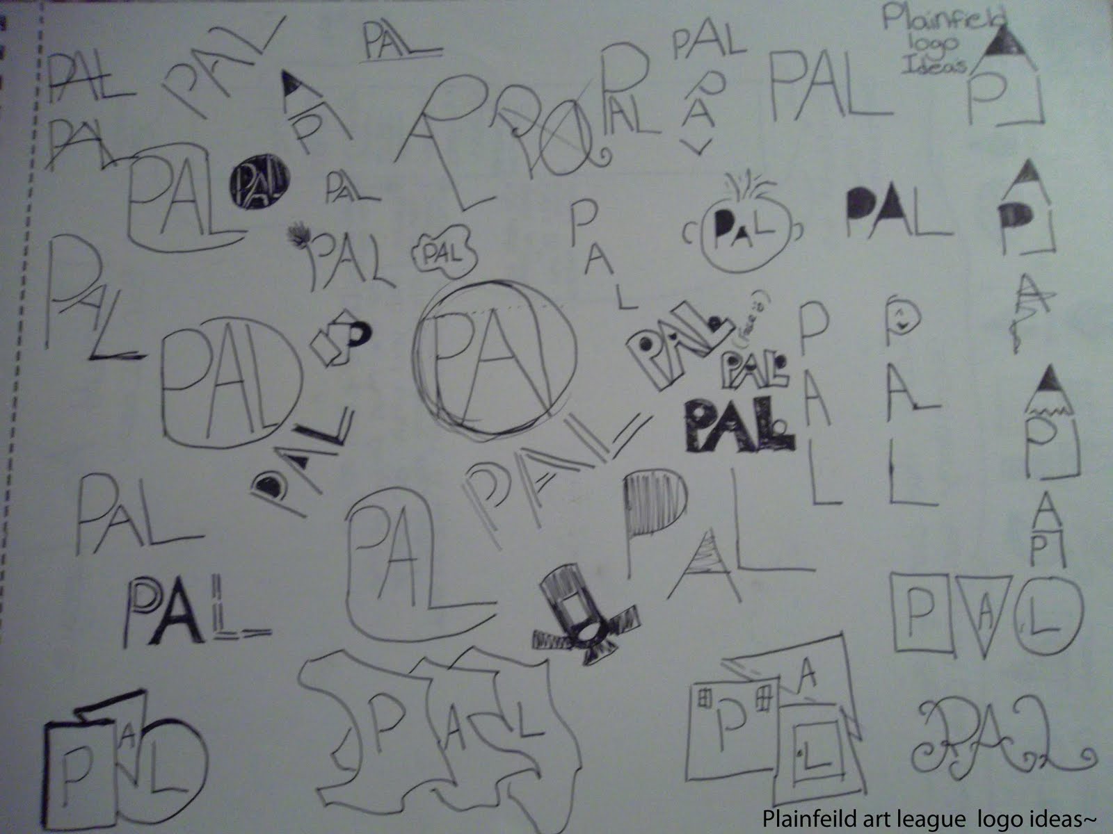
Now that I have been inspired I started to create how I wished the site to be organized.
 As well as to show how I think the categories should be for main and sub-categories which is shown in the chart I have created below.


From here I then created a simple design layout for the Plainfield web site. So far this has all been the planning stages (seems like a lot but really it isn’t and it has been fun, especially with the research part) from here I will then be going into Dreamweaver where I hope to them make this layout come to life and then add text and pictures then polish it up to look as professional as it can be. Wish me luck!

Sunday, August 28, 2011

Saturday, August 27, 2011

A Wrong Turn.

You never know what you might find!


This was taken during one of my random adventures! Took a wrong turn (don't you hate when that happens?) and stumbled across these lovely parked trolleys. One of the best pieces of advice I was given by a few teachers was to always keep a camera with you. Honestly how many times have you caught yourself saying, "I wish I had my camera". I know that I use to say that all the time but now, my camera is a buddy I never leave home without. So thanks to that advice I now have this lovely picture.